
Cycle, 2021
Creative Director, PR Manager, Designer
at Cycle.
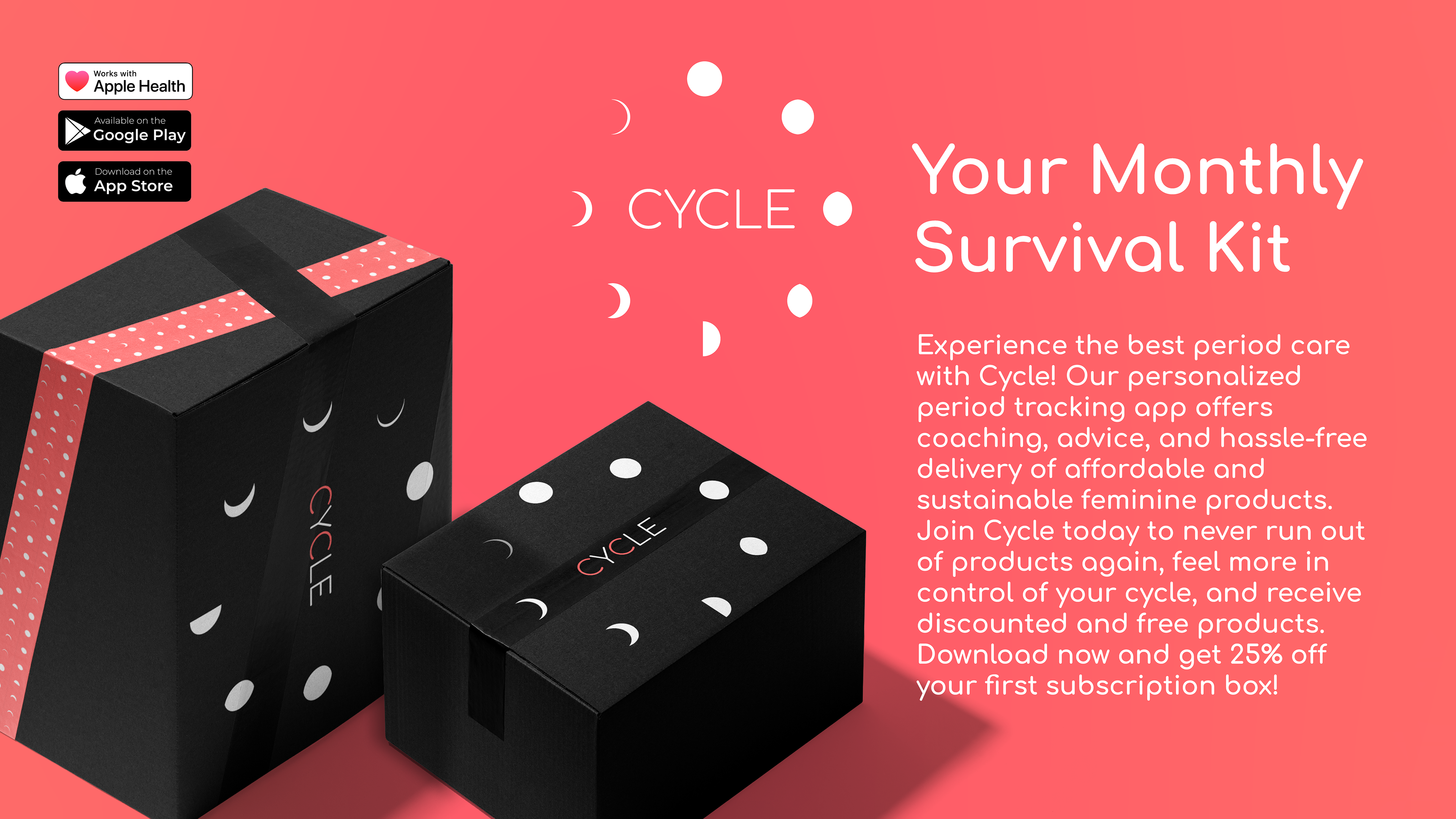
Cycle is the all-in-one Period tracking app and delivery service that makes feminine products more accessible, sustainable and hassle-free
As the Creative Director, Conceptual Designer, and Brand Identity Manager for Cycle, I played a pivotal role in bringing the brand to life. From the initial concept to the final product, I oversaw the development of the brand's name, slogan, UX/UI design, brand identity, press releases, and ad campaigns.
This was an exciting and challenging project, and Phase (1) was focused on creating a brand identity that would appeal to a broad audience, convey a sense of modernity and fun, and offer a user-friendly experience. Through research and feedback from target audiences, we refined the logo and campaign to ensure maximum impact.
Phase (2) involved creating the UI/UX for the app and packaging design, ensuring that every element of the brand was consistent and visually appealing. Finally, Phase (3) involved developing the first ads and launching the ad campaign for Cycle, along with crafting press releases to build buzz and generate interest.
Overall, my role as Creative Director, Conceptual Designer, and Brand Identity Manager for Cycle was critical in developing a strong and successful brand that stands out in a competitive market.
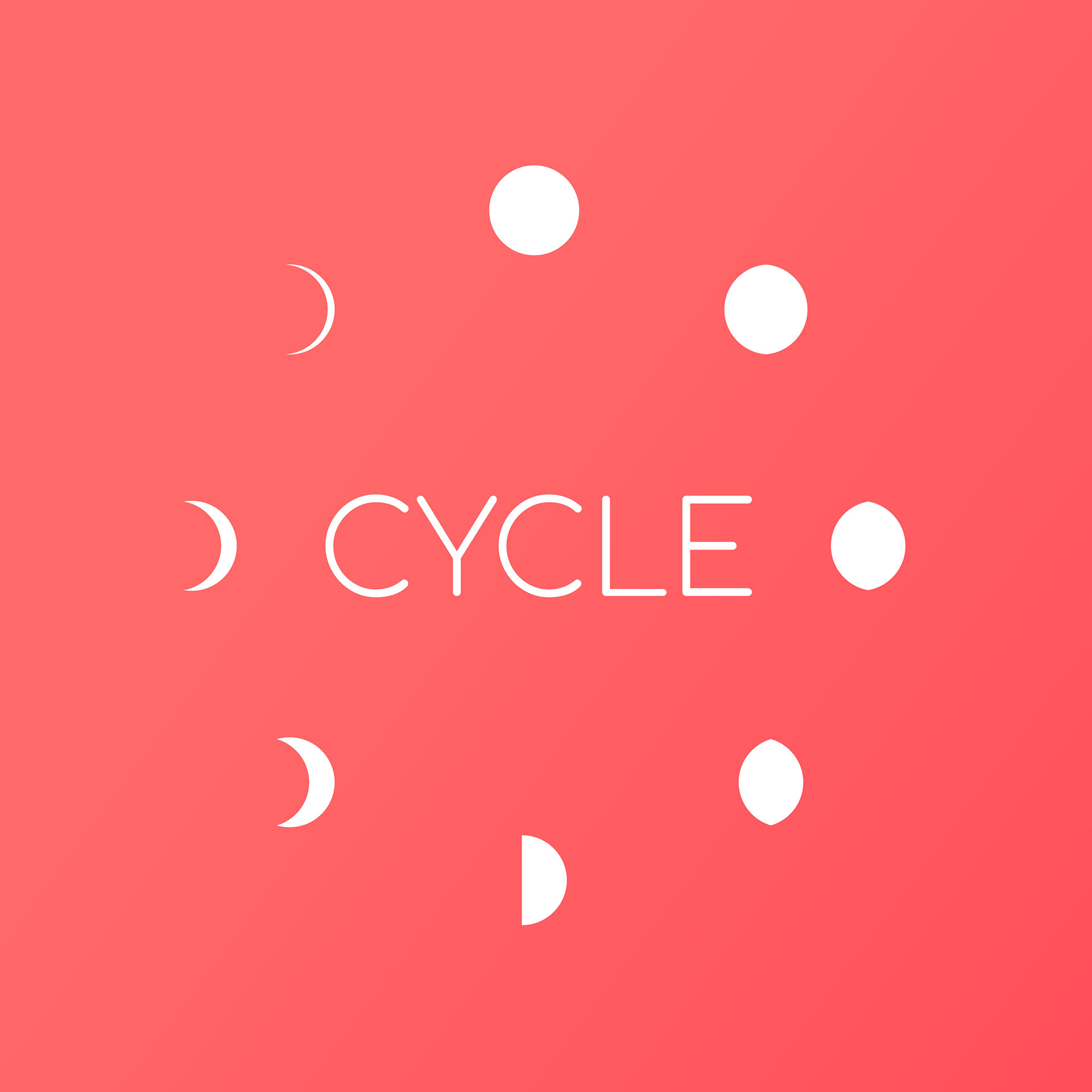
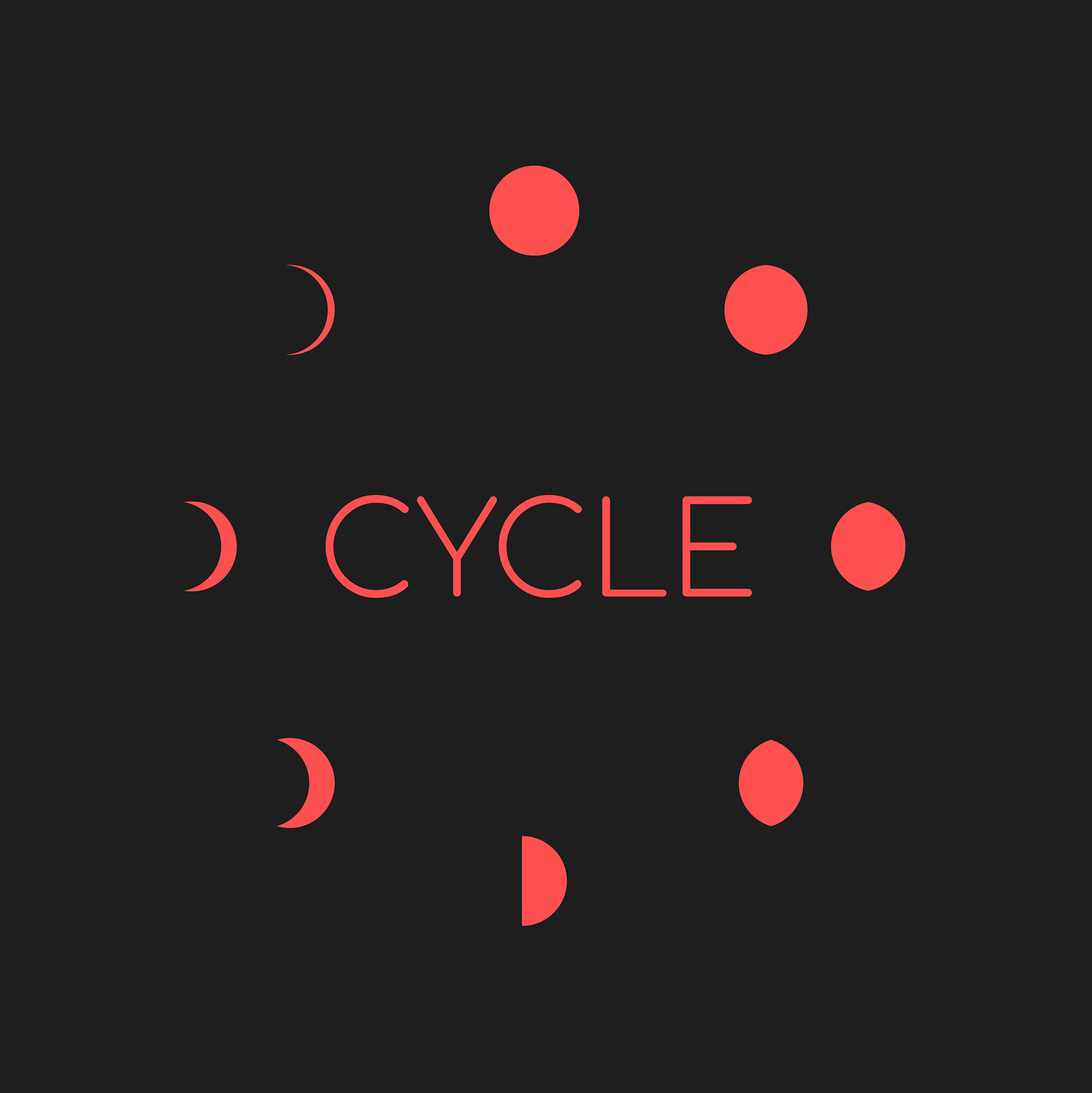
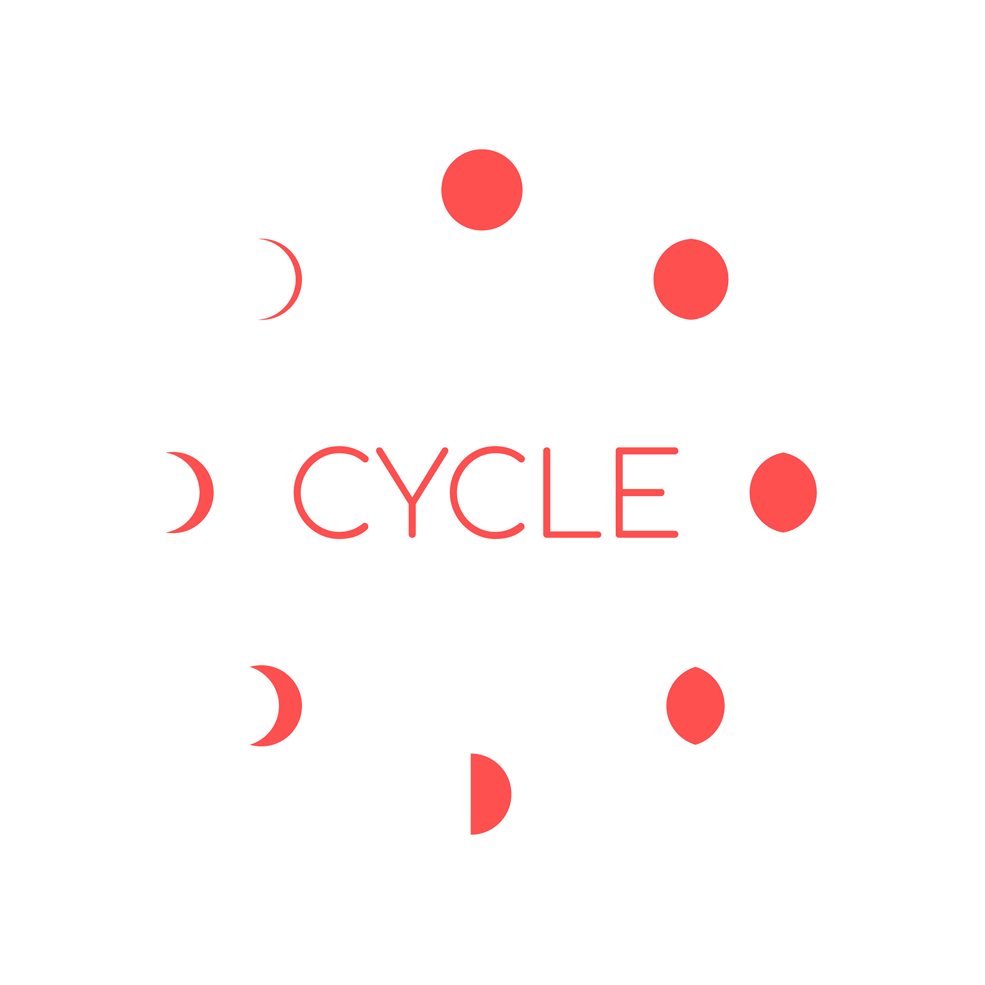
Primary logo and alternatives

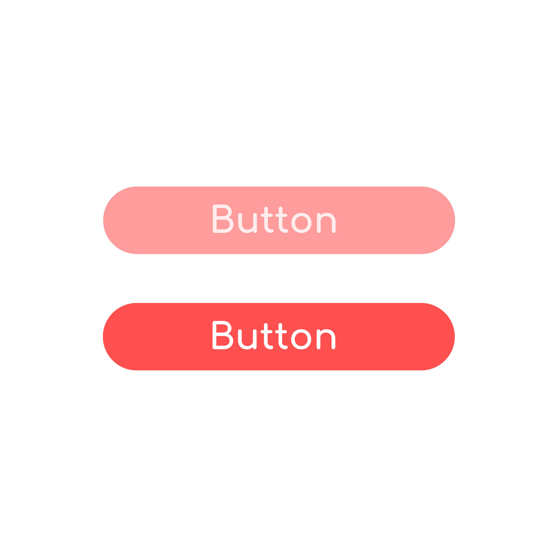
Colour pallet
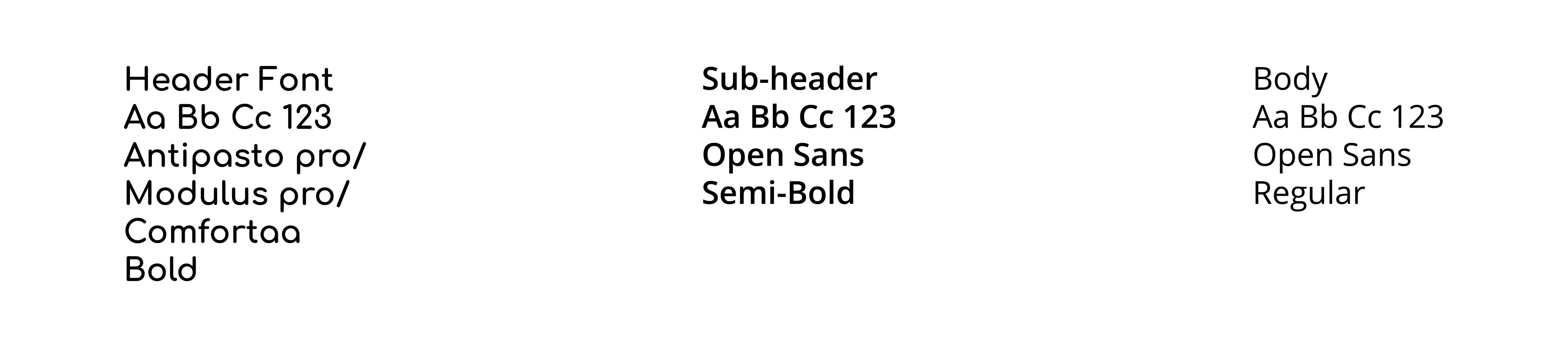
Fonts
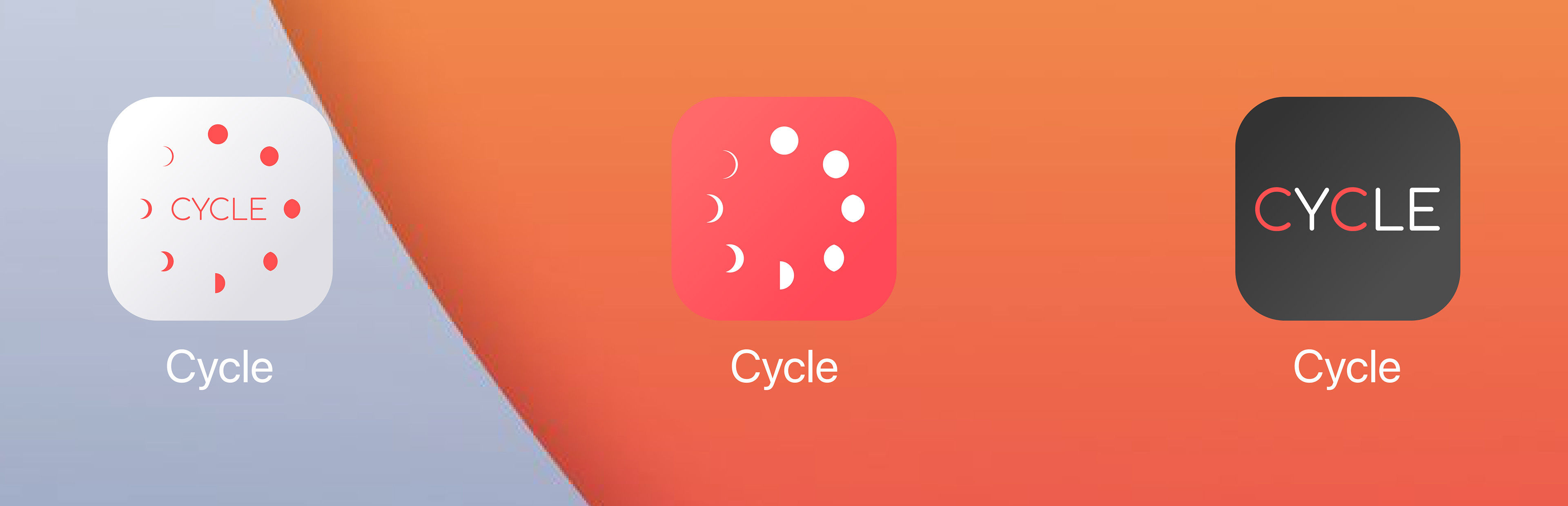
App Icon and alternatives


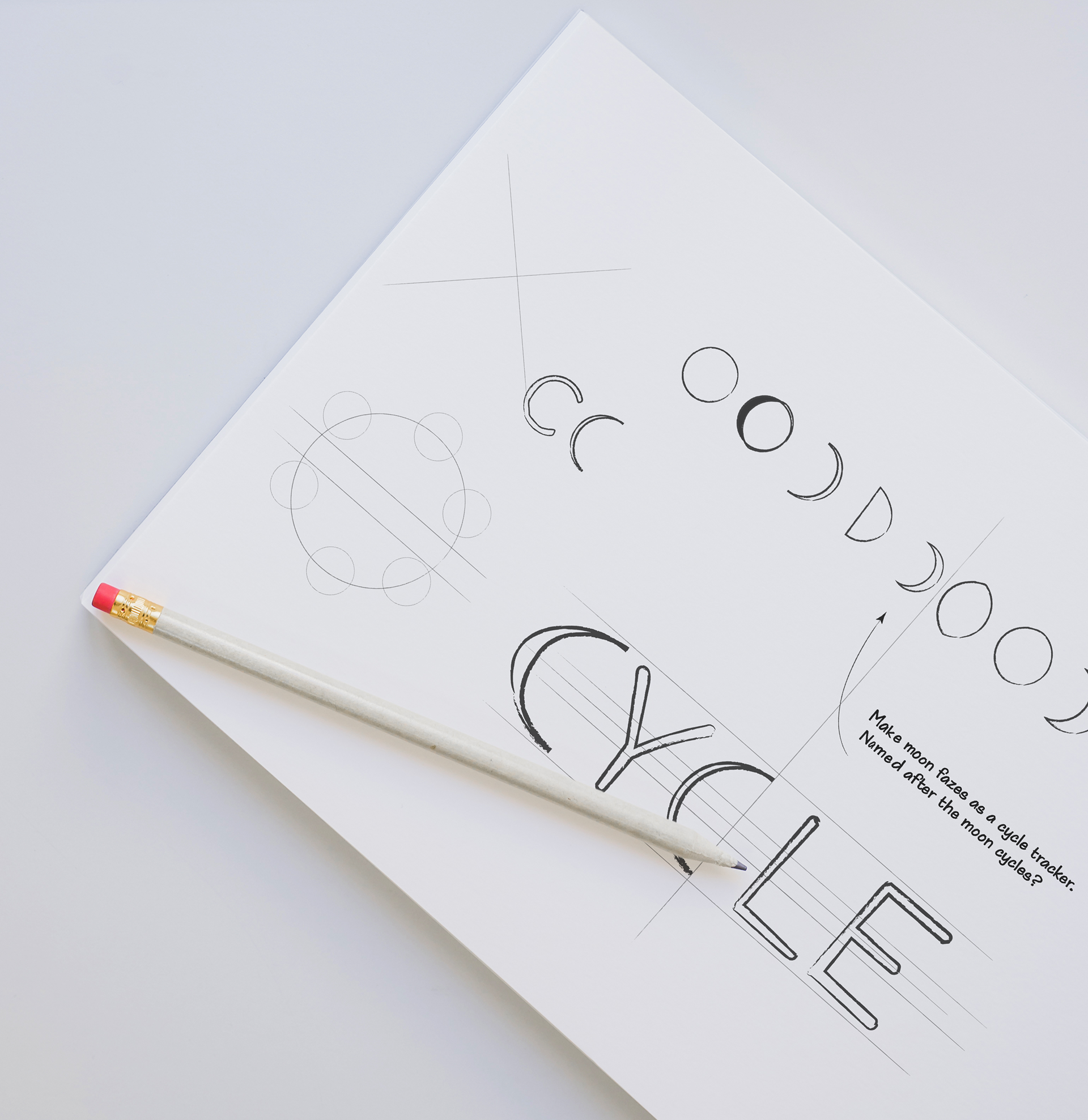
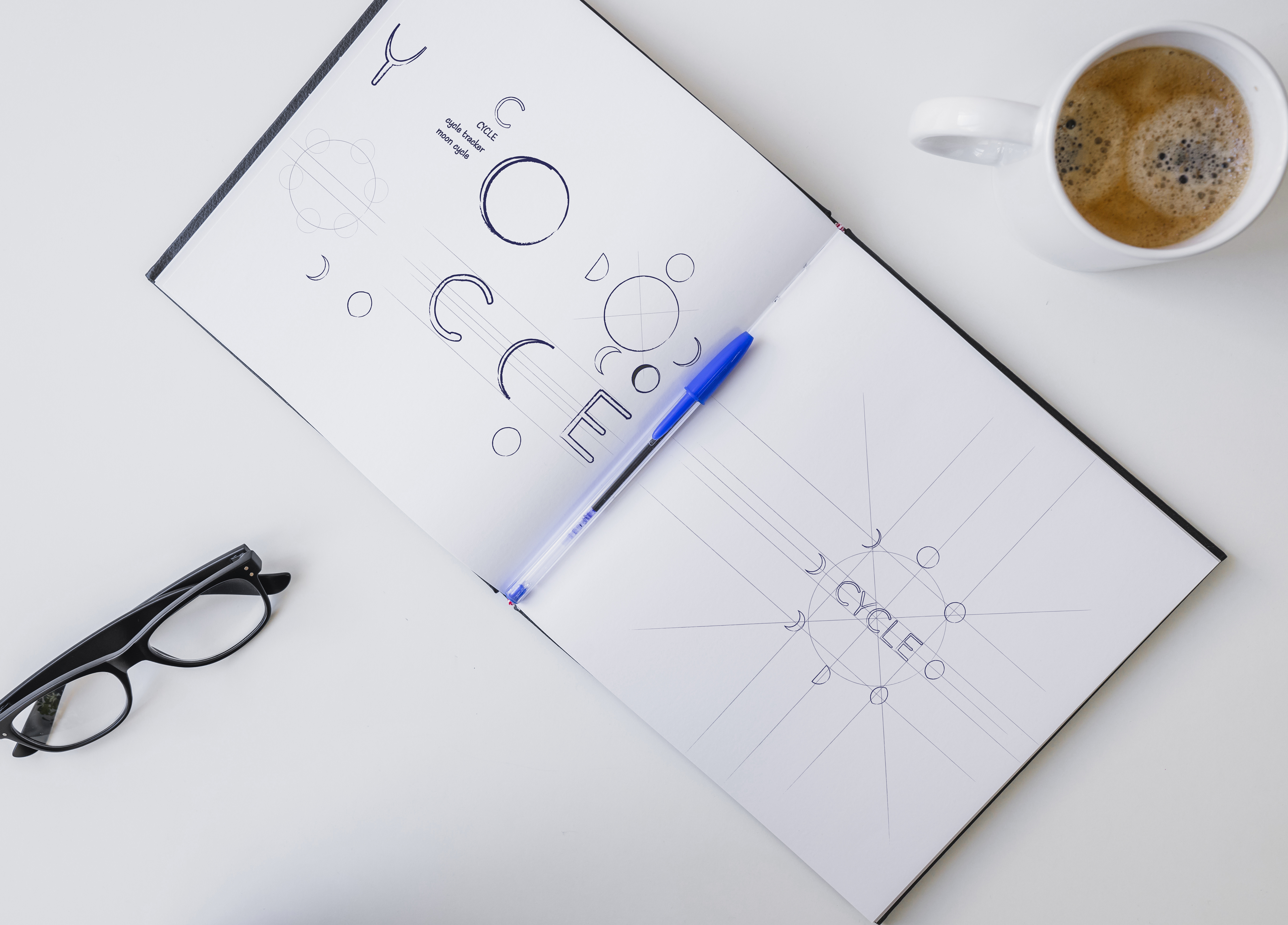
Designing of the Cycle logo
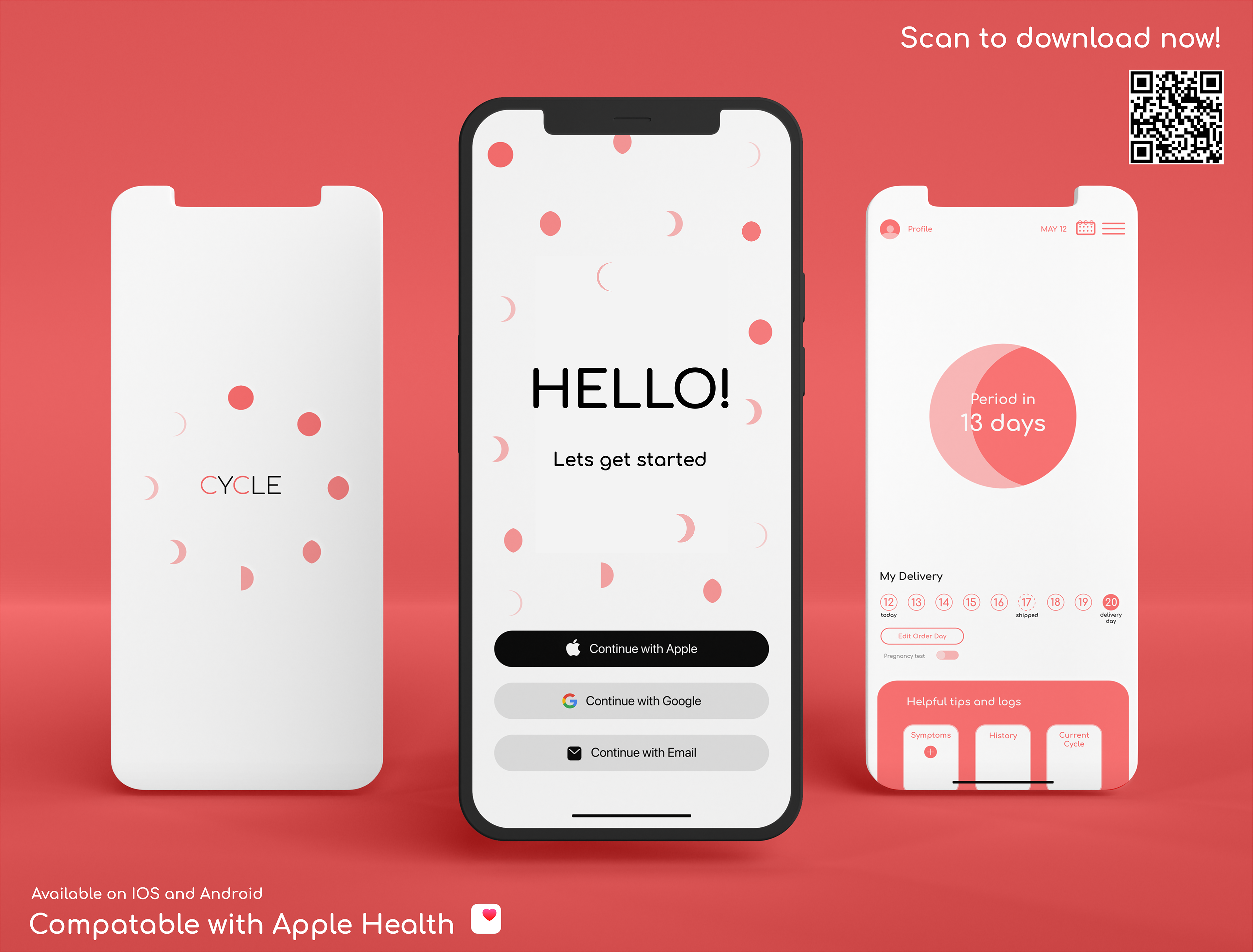
It was especially important that the app design for Cycle to be bright, fun, playful, and be extremely user-friendly. This app will work as a menstrual cycle tracker, shipping tracker, informational, and shop. The app will be the hub for cycle.
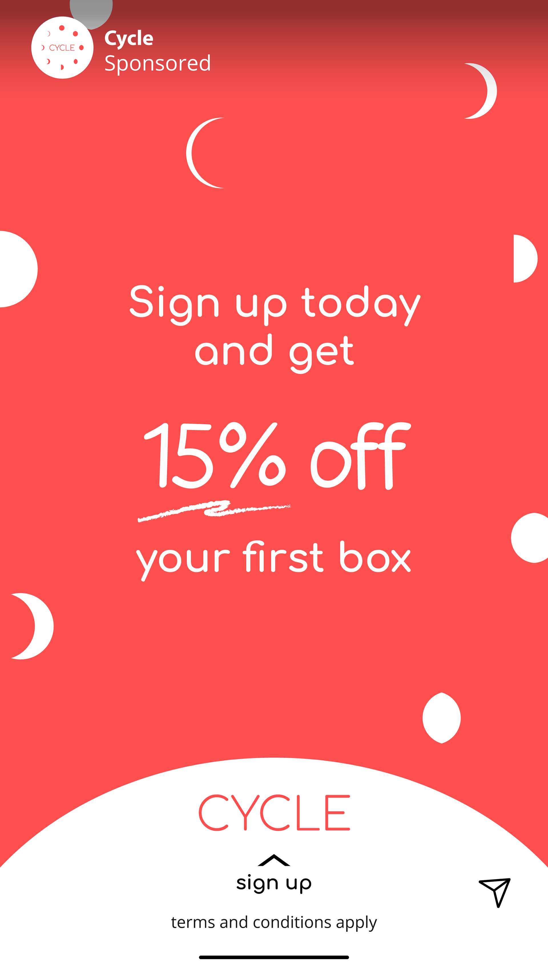
For the creation of Cycle's Instagram ad began with a brainstorming session. The goal was to create an eye-catching and engaging ad that would appeal to Cycle's target audience - women who are looking for a fun and modern approach to their menstrual care.
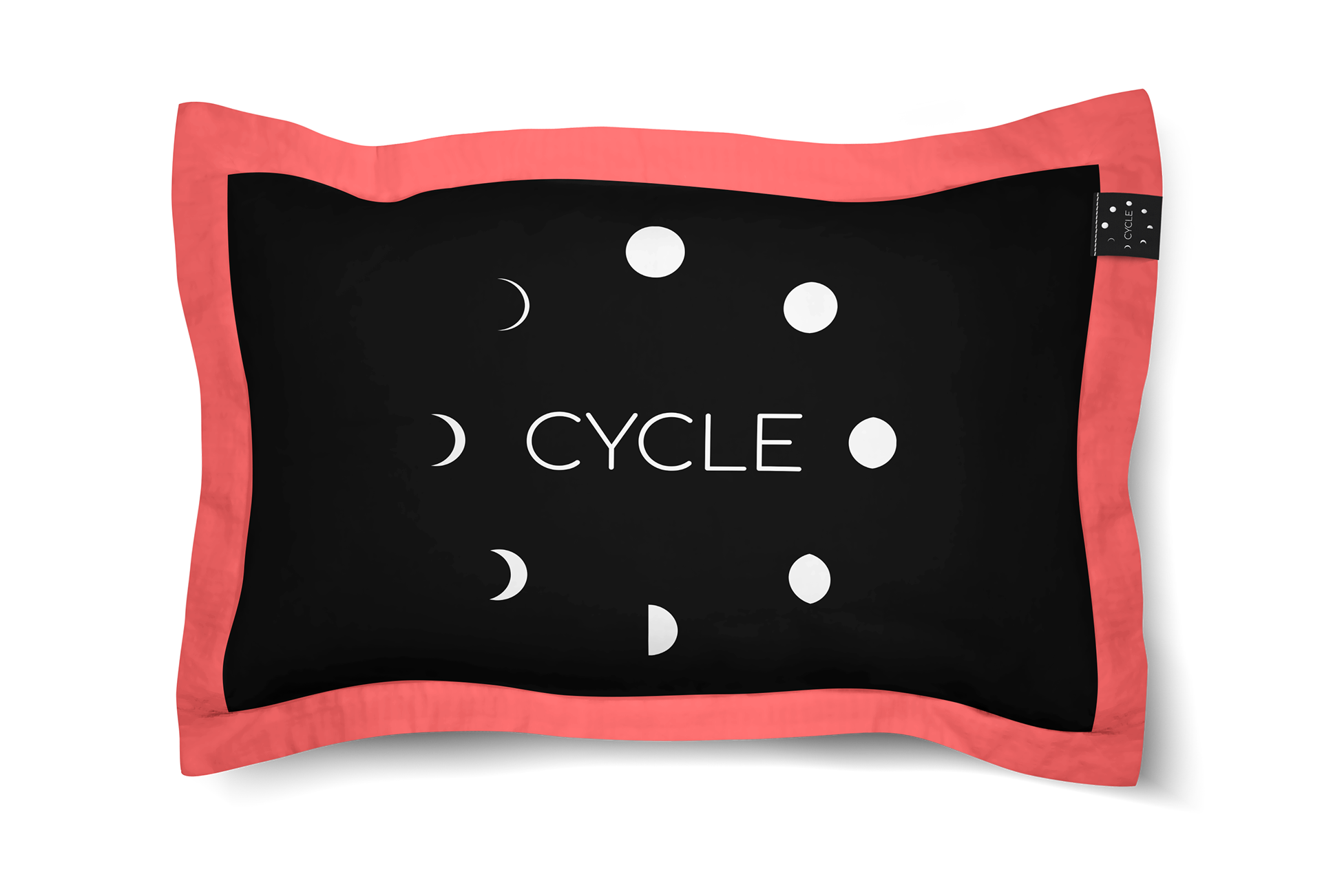
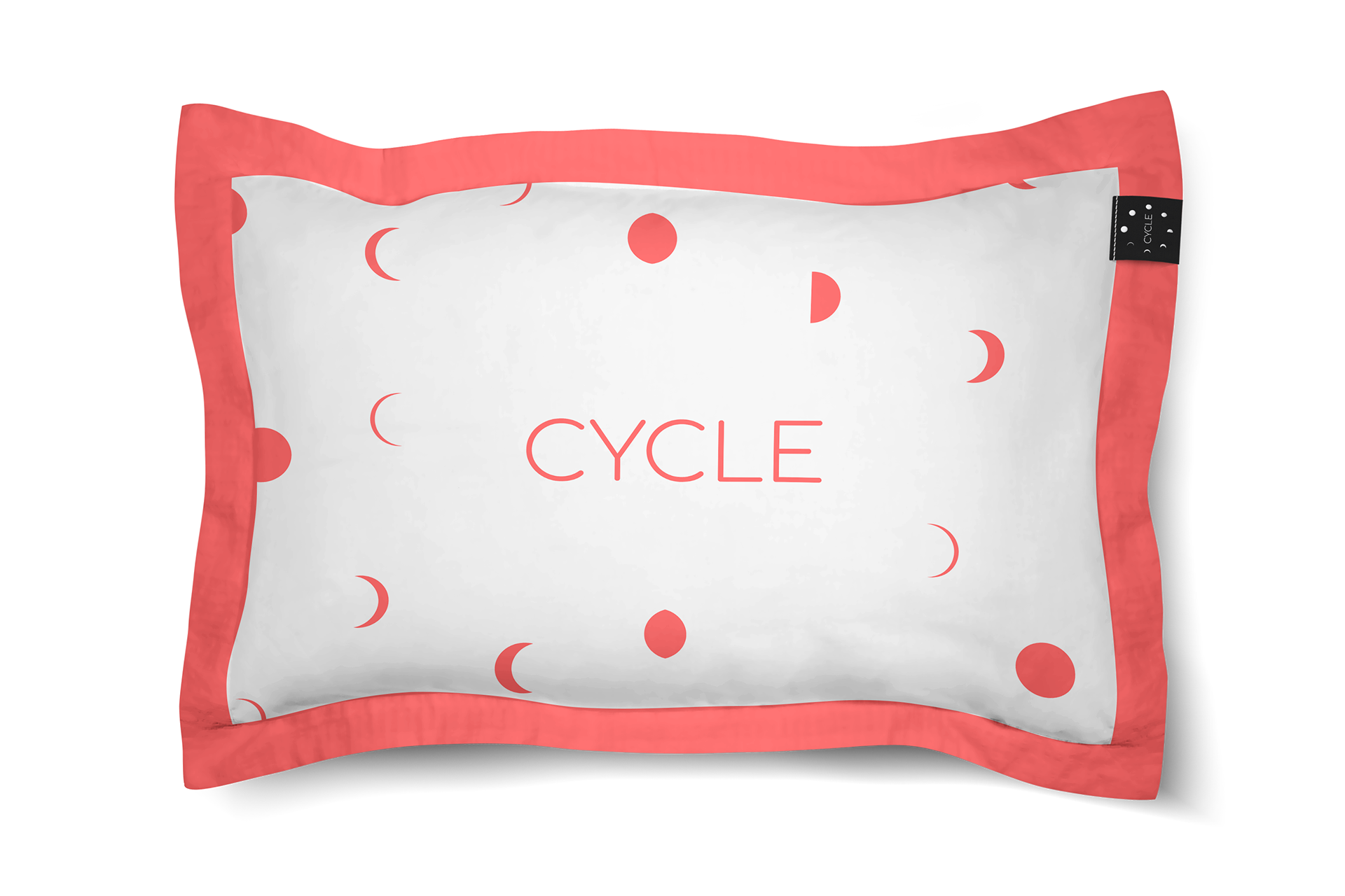
Working with the primary marketing associate, we decided to use the brand's signature bright red color as the background, with white moon phases scattered throughout the design to evoke the connection between menstrual cycles and lunar phases. They also added a white half circle at the bottom of the ad, featuring the Cycle logo and a call-to-action that reads "Sign up today and get 15% off your first box."
The ad was designed to be clean, modern, and playful, reflecting the brand's identity as a fresh and approachable menstrual care company. The ad was optimized for mobile viewing, as most Instagram users access the platform on their smartphones.
After finalizing the design, the ad was tested with a focus group to gather feedback and ensure that it was resonating with the target audience. This ad was important as it would help give direction to the future ads. in the campaign.
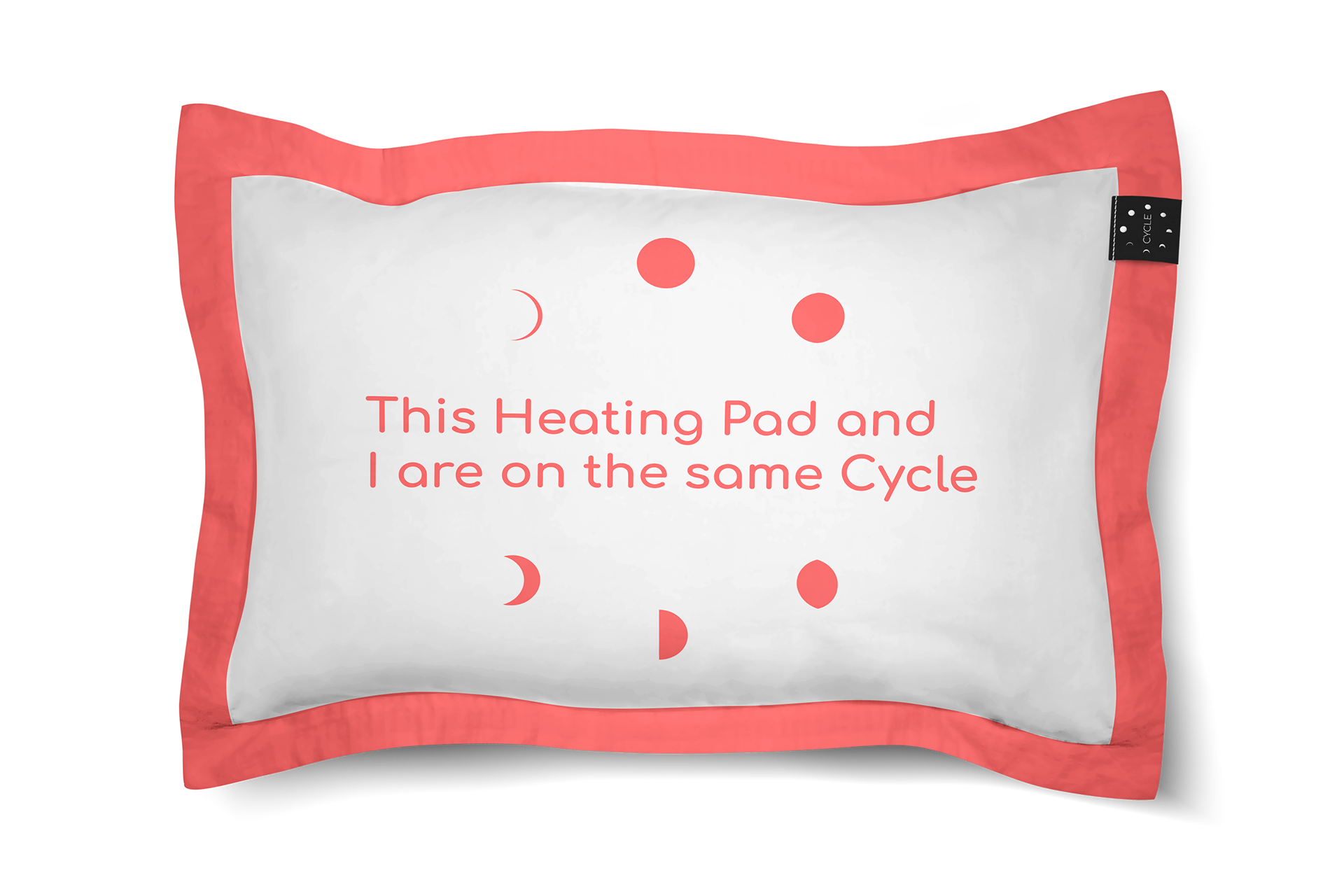

This is the first concept for the heating pads for Cycle.
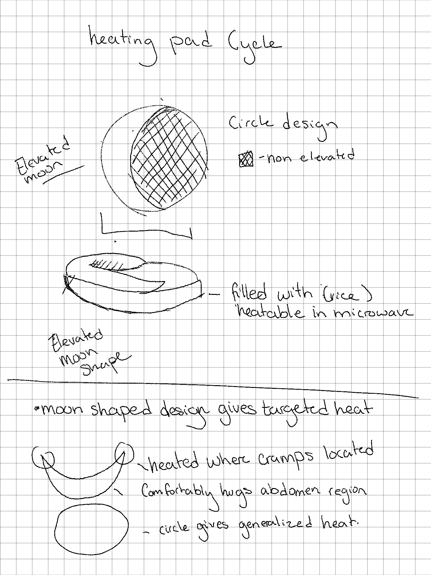
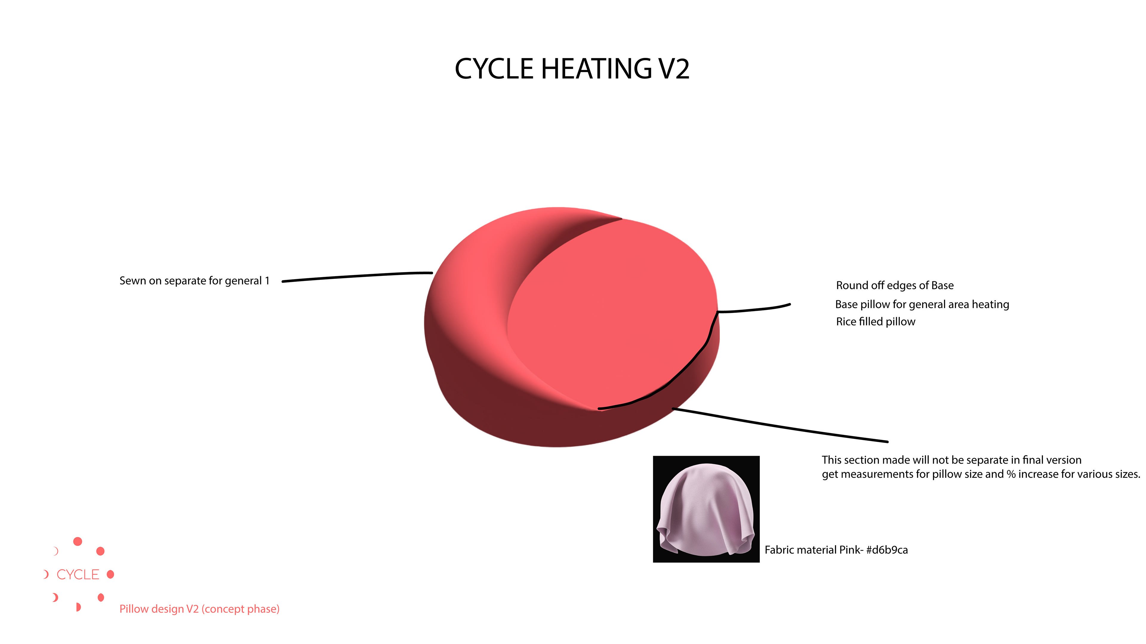

Here are some of the steps into the creation of the Cycle microwavable heating pad, along with its product photography. All steps were completed by me.
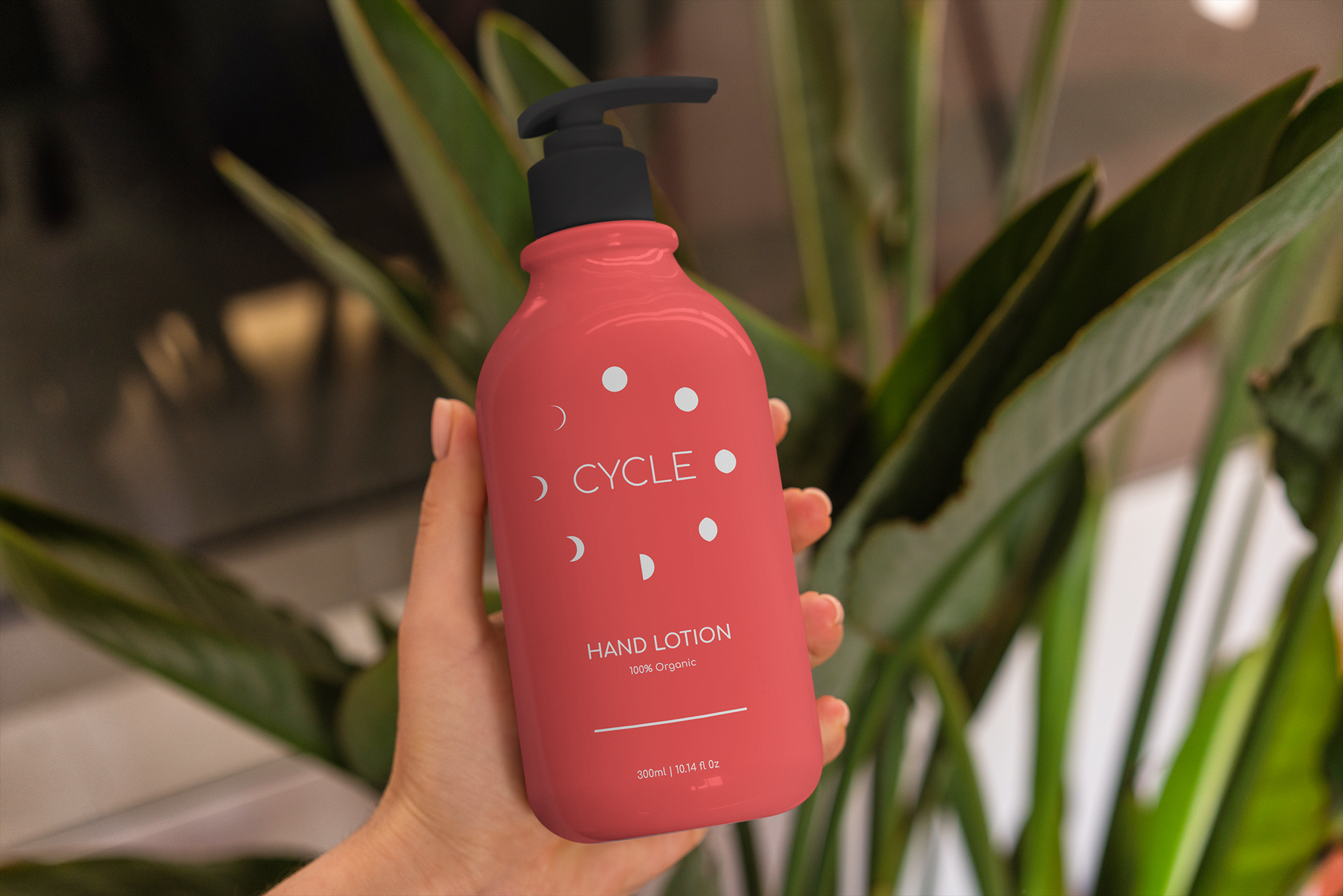
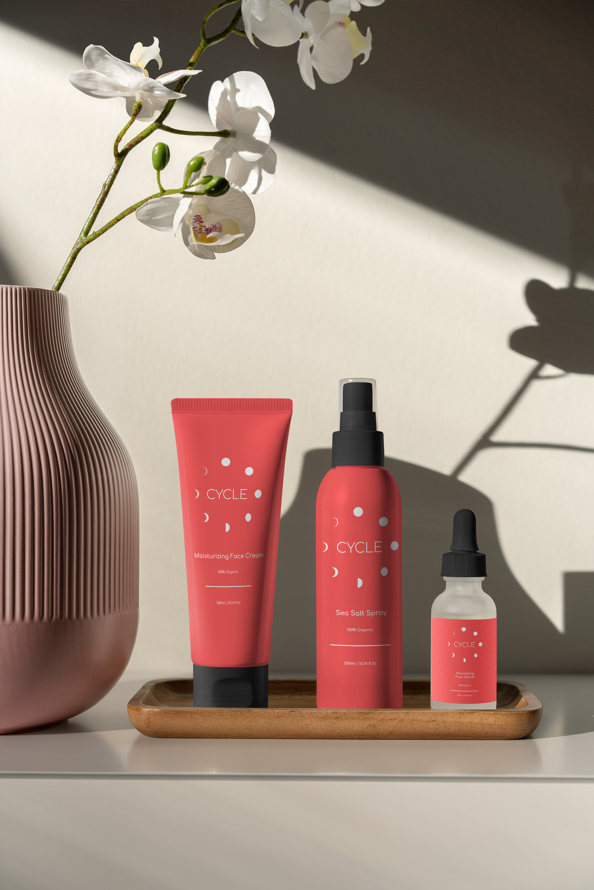
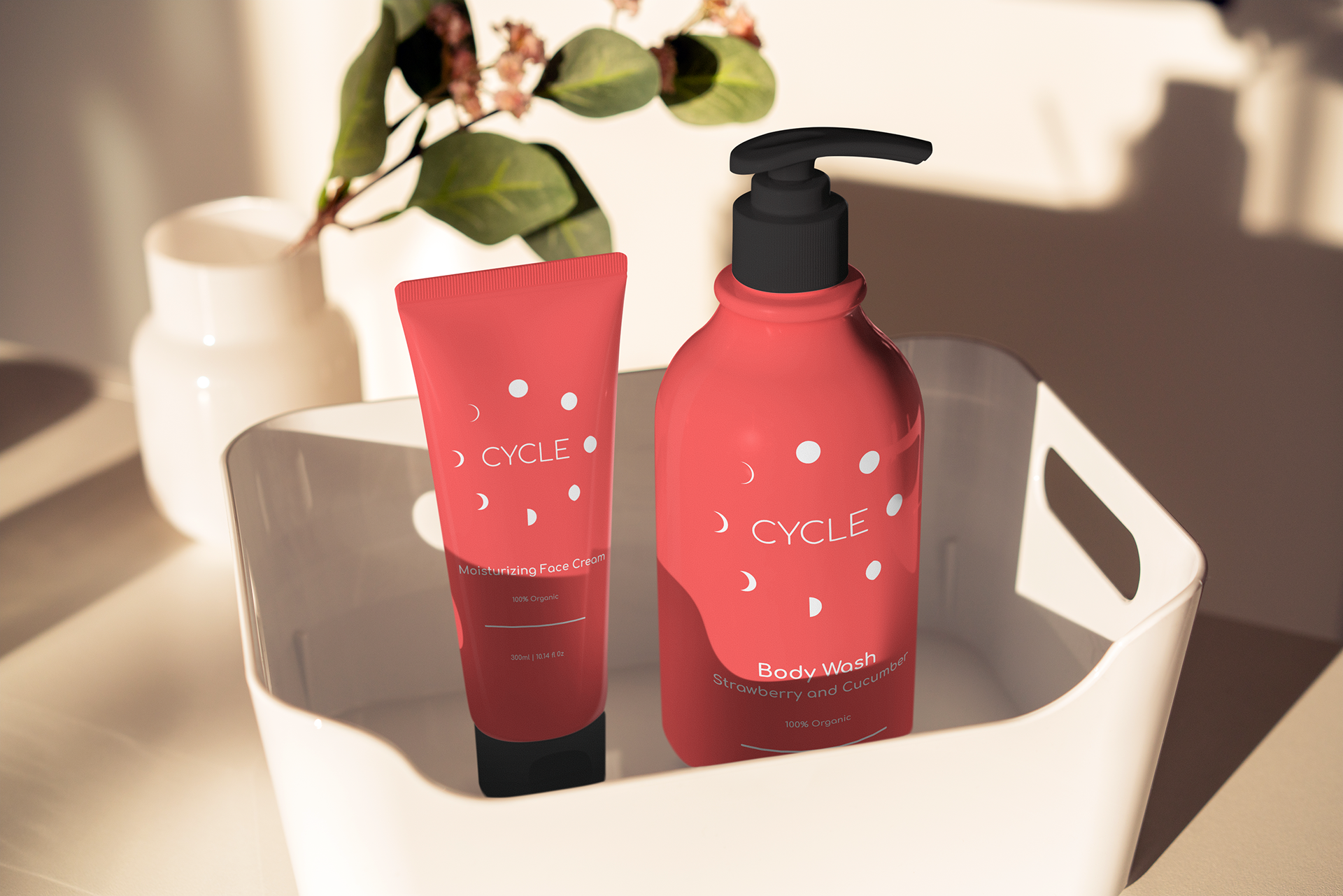
These items will be just some of the products that Cycle will offer in the shop and in the subscription boxes delivered every month.

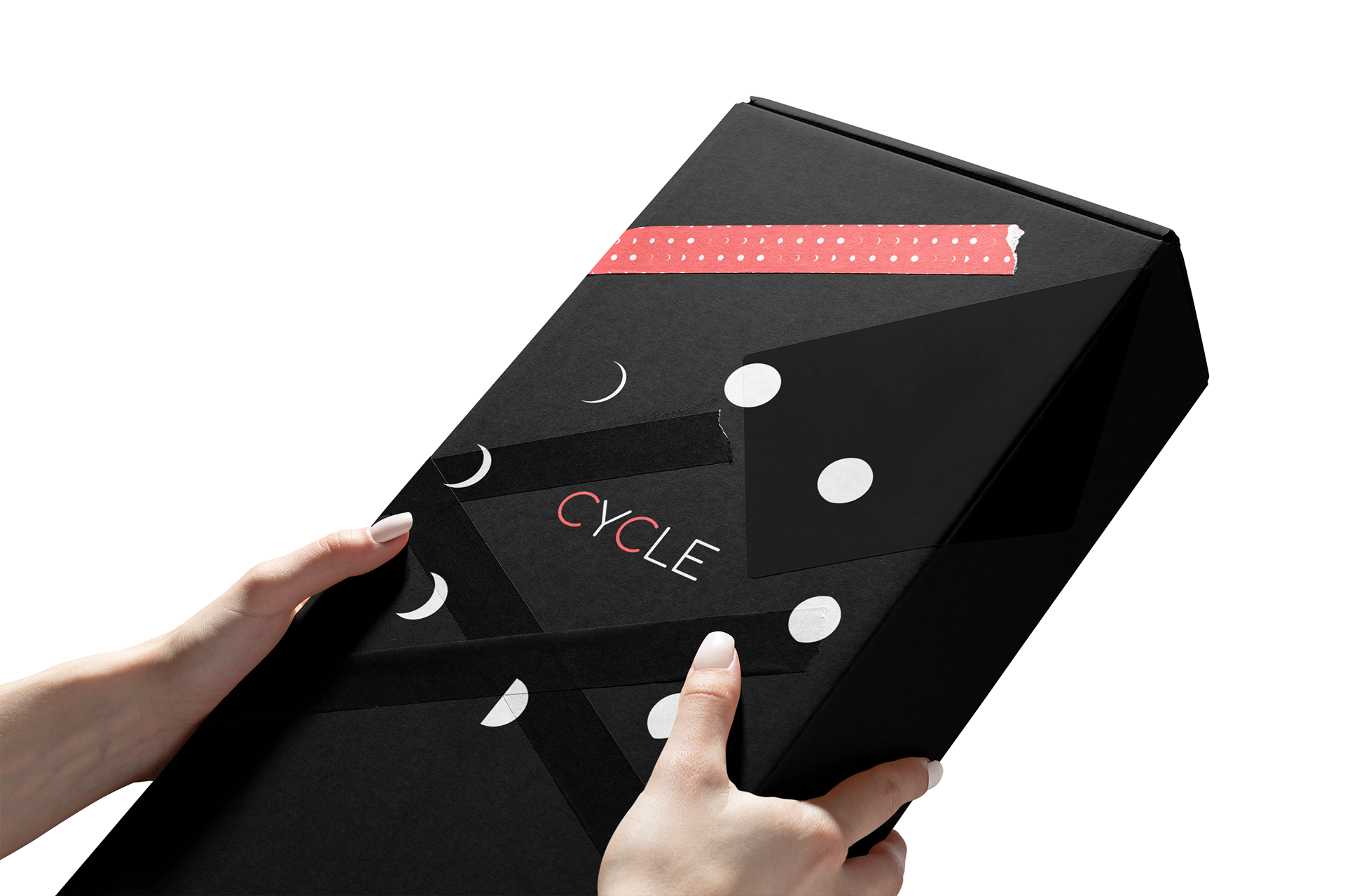
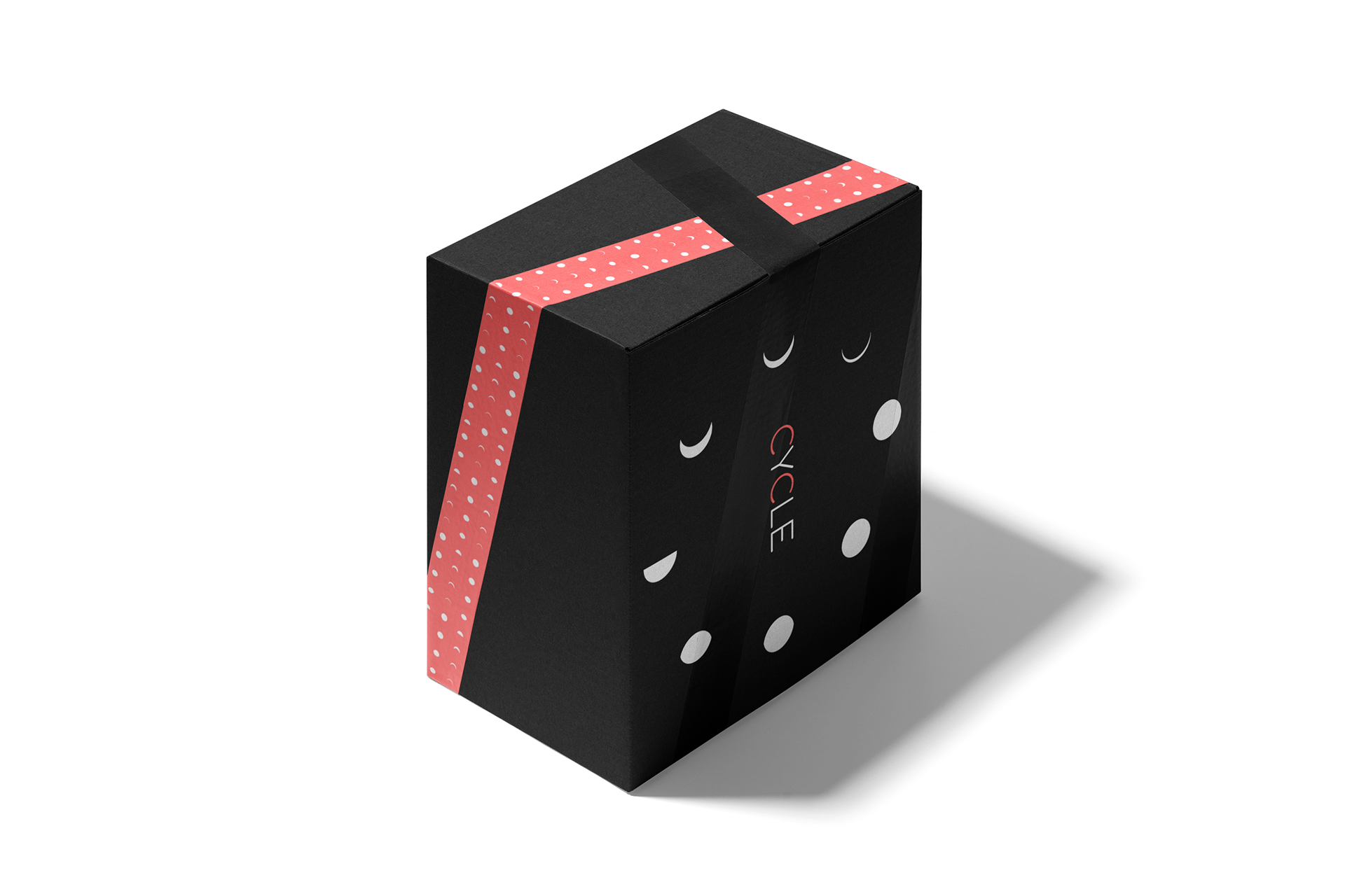
The shipping box for cycle using black cardboard and a white logo. Special tape with the moon pattern and black tape. The unboxing experience is just as important as what's in the box, so delivering a high quality shipping is important.