Fourguys Advertising Agency, 2023
Creative Director, Multi media Designer
During my time at the University of Oneonta, I collaborated with a talented team of colleagues and fellow students to establish an advertising agency. Our mission was to create a responsible drinking campaign that targeted college-age individuals, using a fresh and engaging approach that emphasized the importance of drinking responsibly.
As the Creative Director of the team, I oversaw the creative development of a comprehensive campaign that aimed to educate and inspire young adults to adopt responsible drinking habits. We understood the importance of creating a campaign that avoided glorifying irresponsible drinking while still being appealing and fun for our target audience.
Our campaign received an overwhelmingly positive response from the University of Oneonta, and we are proud to have played a part in creating a safer and healthier drinking culture among young adults. Our efforts may even have the potential to extend beyond the university level and be adopted by other educational institutions


As part of the "Drinkthink" campaign, our team sought to redefine the harmful phrase "don't think, just drink" and raise awareness of the dangers of excessive alcohol consumption. We created the word "Drinkthink" to be an umbrella term for the kind of thinking that occurs while under the influence and developed a bold and memorable logo and slogan. The campaign slogan: "Don't get Drinkthink. Think, drink."
Through our creative process, we aimed to change the conversation around drinking culture and help students make informed decisions about alcohol consumption.
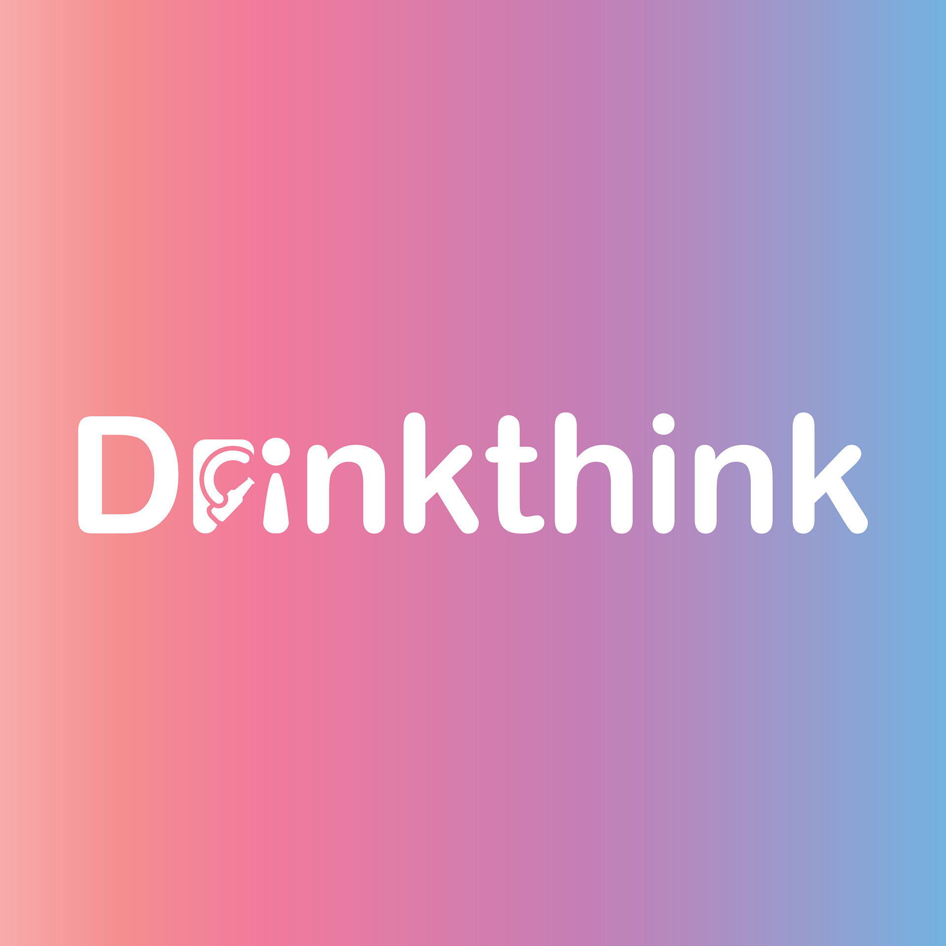
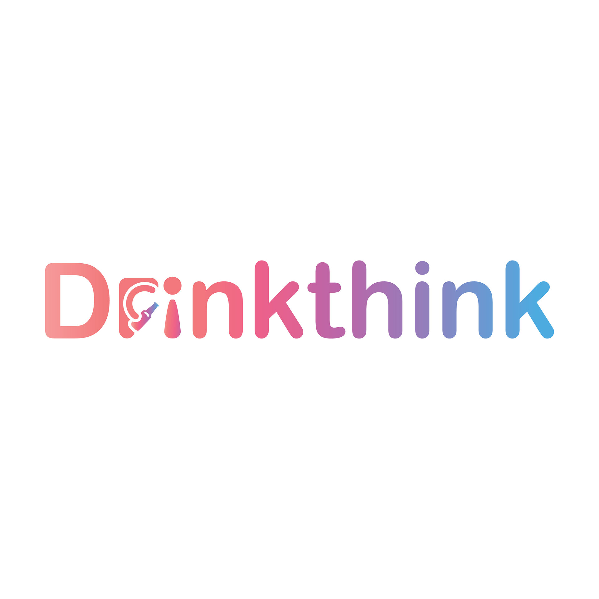
When designing the logo for the "Drinkthink" campaign, our team made a conscious decision to focus on typography. We understood the importance of branding this new word to be immediately recognizable as the campaign, so we developed a unique and eye-catching font focused logo that captured the essence of the campaign's message.
To add context and visual interest to the typography, we incorporated a vomiting person using the 'r' and 'i' of the word. This creative decision not only made the typography more visually appealing but also helped convey the campaign's messaging more effectively.
It was important to use bold and eye-catching colors that would capture the spirit of "party culture" and appeal to our target audience of college students. We utilized a modern and bright gradient to achieve this, creating a logo that was fun, memorable, and brand-able.
The decision to animate the "Drinkthink" logo was based on the need to further associate the term with irresponsible drinking. By creating an animated character that takes a drink and then throws up, we were able to clearly associate The definition of "Drinkthink" without explanation. Animating the logo also helped to create a more compelling and engaging narrative around the campaign, making it more memorable and impactful for our target audience.
As the designer of the Drinkthink website, my primary focus was to create a modern and user-friendly interface. There was a ,massive importance to use a cohesive color theme to create visual consistency throughout the website.
In creating the website, I aimed to achieve a balance between simplicity and aesthetics. The website's minimalist design makes it easy to navigate, while still being visually appealing. This was crucial as the website serves as the main hub for the "Drinkthink" campaign.
I kept in mind the website's target audience, and if the website was not easy to use and visually appealing, they would not stay on it for long. Therefore, I made sure that the website was designed to be easy to navigate and engaging to capture the audience's attention.
The Fourguys advertising team organized a highly engaging kick-off event during college orientation to effectively reach out to new students. By combining a series of educational speakers, fun games, interactive activities, and exciting prizes, we could successfully raise awareness about safe and responsible drinking practices among the college community. By creating this entertaining and memorable experience we can increase the impact of this campaign.
To provide an engaging and memorable experience for students, I designed an innovative solution that combines augmented reality with a drink coaster. Instead of traditional paper brochures, I created a virtual brochure experience that utilizes augmented reality technology. This experience is conveniently attached to free drink coasters that were distributed during the kick-off event. This approach not only reduces paper waste, but also offers a unique and interactive way for students to learn about safe and responsible drinking.
Teaser for the "Drinkthink" Commercial
To build anticipation for our "Drinkthink" commercial, we took to the college town and set up a funny "Drinkthink" moment. By capturing the raw footage and interview style video we created a short teaser that intrigued viewers to learn more about our campaign. Our decision to embrace the popular social media trend of raw footage and interviews was a deliberate choice to connect with our target audience and create a relatable tone for the campaign.
"Drinkthink" Commercial
To develop a truly effective ad campaign, we started with a quick flashing word intro, which is a powerful strategy for capturing the attention of a younger audience. From there, we incorporated short clips of embarrassing and drunk moments to tap into the social acceptance rhetorical strategy, social proof, and fear appeals. By showcasing the undesirable and sometimes cringeworthy behaviors that can result from excessive drinking, we aimed to encourage viewers to avoid similar situations and steer clear of becoming a laughing stock among their peers.
This approach aligns with the cognitive dissonance theory, which suggests that people experience discomfort when their beliefs and behaviors are inconsistent. By exposing the negative outcomes of excessive drinking, viewers are more likely to experience cognitive dissonance and take action to change their behavior.
We also used the social learning theory, which states that people learn by observing the behavior of others. By showcasing the negative consequences of drinking in a relatable and realistic way, we aimed to encourage viewers to learn from these experiences and avoid repeating the same mistakes.
Radio Spot
Our radio spot was designed to capture the attention of listeners who are used to tuning out traditional ads. To do this, we tapped into the current trend of using AI-generated voices. A social media trend that uses presidential voices in a comedic and non-political way. Using this trend allowed us to deliver important information about responsible drinking in a humorous and engaging way. During testing, our radio spot achieved a remarkable 0% skip rate, demonstrating its effectiveness in reaching our target audience despite its relatively long runtime!
.
The official "Drinkthink" slogan, logo and Icon
It was also important to engage with audiences on social media platforms. We created a "Drinkthink" instagram filter that throws-up when the user opens their mouth!
